Dashboard Templates / [Template Name]
Campaign Reach and Engagement
Get a clear, up-to-date view of how your fundraising campaigns reach and engage supporters, with automated insights that connect visibility, engagement, and outcomes in one simple dashboard.
What is a Reach & Engagement Dashboard
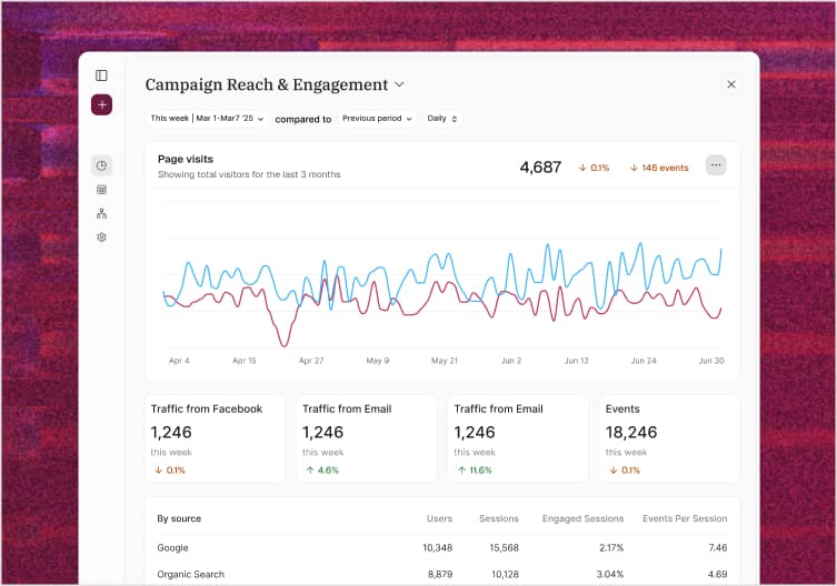
A Reach & Engagement Dashboard is a centralized reporting view that helps nonprofits understand how widely their fundraising messages are seen and how supporters interact with them. It brings together key visibility and engagement metrics, such as reach, impressions, clicks, and supporter actions, into clear, easy-to-understand visuals. This gives fundraising and communications teams a holistic view of campaign performance and audience response in one place. Modern reach and engagement dashboards go beyond basic platform reports by showing trends over time, comparing performance across campaigns and regions, and highlighting where messages resonate most. With automated data syncing, the dashboard stays up to date without manual exports or spreadsheets, creating a reliable single source of truth for understanding supporter reach, engagement, and momentum across your campaigns.
What should a Reach & Engagement Dashboard include?
Core reach and engagement metrics
A campaign reach & engagement dashboard should surface the essential metrics that show how widely your campaigns are seen and how supporters interact with them. This includes reach, impressions, clicks, click-through rate, and conversion rate. Together, these metrics help you understand visibility, interest, and where engagement turns into meaningful supporter action.
Campaign-level performance insights
Beyond top-level numbers, the dashboard should make it easy to compare performance across different campaigns, appeals, or channels. Engagement trends over time, regional performance, and audience-level breakdowns help teams identify what’s resonating and where campaigns may need refinement.
Connection to fundraising outcomes
An effective dashboard should link reach and engagement data to real fundraising results. Metrics such as cost per engagement, conversion performance, and return on campaign spend help nonprofits understand how efficiently resources are being used and which efforts deliver the greatest impact.
Clear, actionable visualizations
To support fast decision-making, dashboards should present data in clear, intuitive visual formats. Simple comparisons, trend lines, and flexible views allow fundraising and communications teams to spot patterns quickly, share insights confidently, and take action without needing technical expertise.
How it works
Step 1: Sync with your tool in a few clicks
Connect your account to Filament with a few clicks, and get instant access to your data.
Step 2: Instantly access your dashboard template
We automatically build the right dashboard for your data sources out of the box.
Step 3: Ask questions about your data
Ask Filly AI to dive deeper into your data to spot hidden trends and insights.
Key campaign metrics you can track in Filament
Why Filament?
Nonprofit software built to help you do more.
Whether you’re tracking donations, supporter engagement, or campaign performance, Filament helps you understand what’s happening and why. We’ve helped nonprofits and mission-driven teams set up clear, actionable reporting with confidence. Reach out to see if it’s right for you.
Bring your data together. Bring supporters closer.
See all your fundraising data in one place, understand your donors more deeply, and raise more for your mission.
Bring your data together. Bring supporters closer.
See all your fundraising data in one place, understand your donors more deeply, and raise more for your mission.
Bring your data together. Bring supporters closer.
See all your fundraising data in one place, understand your donors more deeply, and raise more for your mission.
Other dashboard templates you might like

❤️ Regular Giving
This dashboard is a comprehensive view of your campaigns reach and engagement. It includes metrics such as impressions, clicks, and conversions.


💖 Fundraising KPIs
This dashboard is a comprehensive view of your campaigns reach and engagement. It includes metrics such as impressions, clicks, and conversions.


💶 Donor Acquisition
This dashboard is a comprehensive view of your campaigns reach and engagement. It includes metrics such as impressions, clicks, and conversions.

Learn more